Decluttering 13 years of design debt
a Leaner design system
The overall platform experience was inconsistent and the component library was bloated. Intelligence Bank was in period of growth. They had made some headway in establishing some design guidelines. There was no single source of truth and developers were getting increasingly frustrated with creating duplicate components.
Originally, there was no allocated time to dedicate to scaling the design system and we did not have the resources. We simply had to chip away at it on a adhoc basis. However, during the last quarter of the year (Traditionally, a quieter period) we were given the green-light to focus on this package of work.
Read in 5 minutes
Review and Audit
Let the decluttering begin
I began by looking at all the existing asset libraries in Figma. I discovered that there was no defined type scale, lots of unused colours, multiple icon libraries and duplication in UI patterns.
The Goal
Atomic
Following the Atomic design methodology introduced by Brad Frost, we proceeded to fix the basics. This approach encourages modularity, reusability, and consistency (Our biggest problem) in design and development by starting small, creating reusable parts to build into more complex components.
Colour, Text and Buttons
In terms of colour, some of the hues were very similar. In particular, the grey palette was full of unnecessary shades. We also had to consider that our platform was available for clients to customise. They could change colour for different elements, font size and families. So as you can imagine, this had the potential to create a variety of inconsistencies.
To protect the visual integrity we introduced a few constraints such as, semantic colours used for errors, information etc would be standard across all client sites. There was flexibility in the type faces used at the clients discretion. For design-only purposes we refined the type scale to ensure they blended harmoniously.
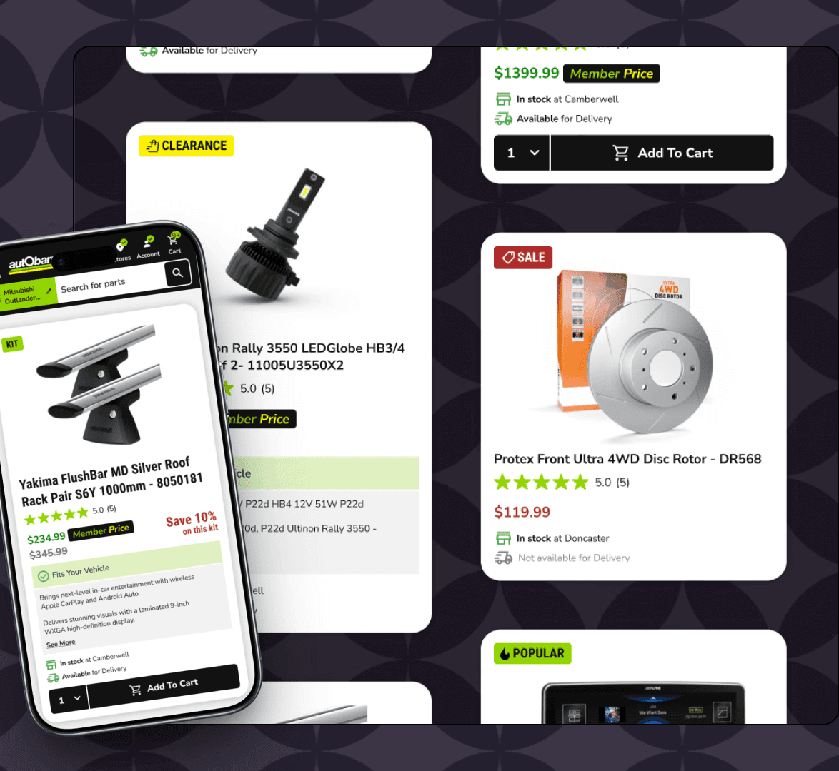
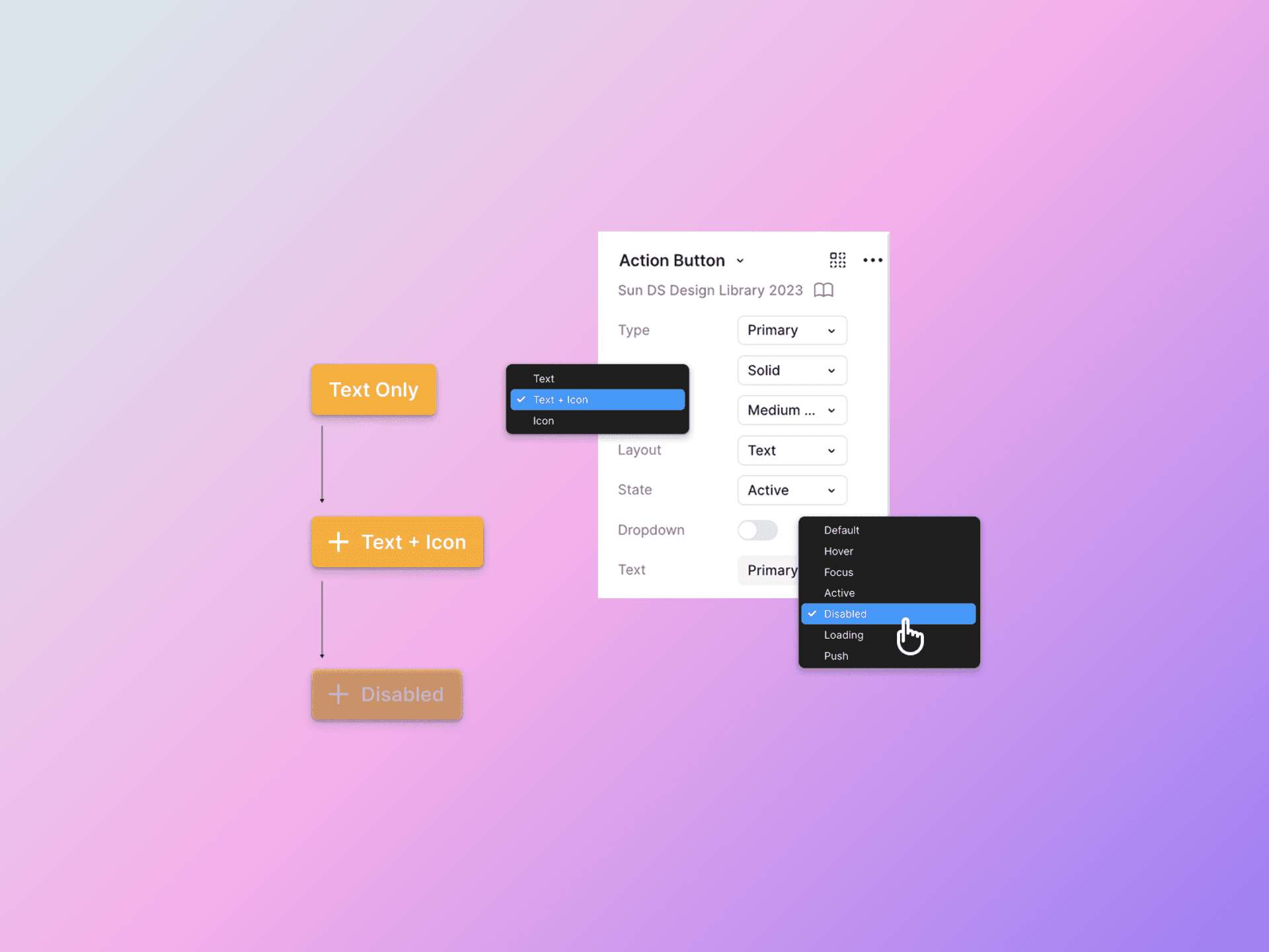
Buttons are one of the most frequently used components in any interface. Using Figma variables and properties all button styles, states and properties were consolidated into a single component. For our use cases button layouts also need to consist of text and icon and also icon only. In some instances, a drop-down icon can be toggled on and off.
Integrating the icon library
Icons in storybook.js
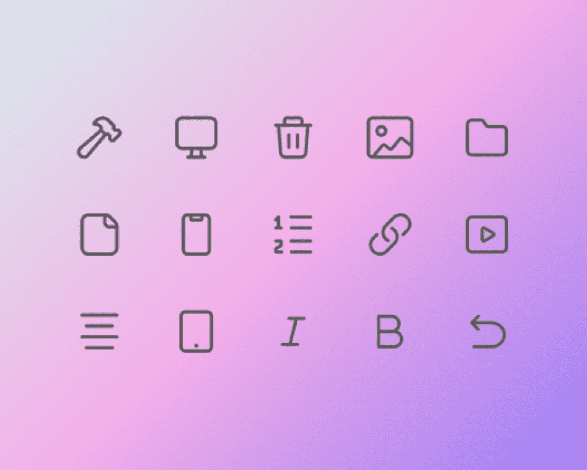
We spent some time reviewing the existing icon libraries. In the platform we could see inconsistencies in the icon styles. This was due to multiple libraries being used over time. We opted to go with Google icons and symbols as they are universally recognised, versatile and represent actions well. For developers their open source availability makes them freely usable across all projects. We decided to integrate the icon as a component in storybook js. Like other components it allows for isolated development and testing and takes just 4 steps:
1. Prepare your icons
2. Create icon components
3. Create Storybook stories
4. Integrate with your projectproject components and use them as needed.
Source of truth
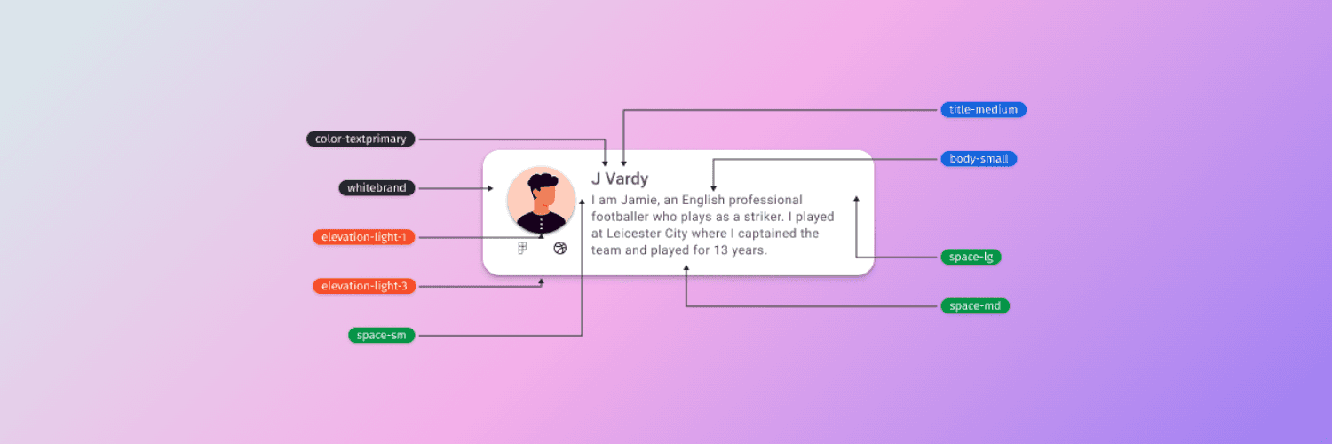
The Token Structure
When spacing, shadows, strokes are done badly visual inconsistencies begin to creep in. Design tokens are an important part of the design system allowing designers and developers to be truely in sync.

Summary
Complex components
It was satisfying to finally clean up the design system. By having the fundamentals in place means you can design and build with greater confidence, clarity and speed. Designing systematically meant we were able to develop advanced components, like our brand portal properties panel, both painlessly and efficiently.