Engaging 170,000 residents
Making local Government feel human
Low adoption was incomprehensible. Engagement on mobile devices was almost non-existent. Disorganised information and cluttered interfaces with content difficult to find. On top of this, accessibility standards were below par causing task abandonment and as a consequence, putting pressure on the Customer Connect Team. I led the redesign of the council's website and self-service portal with the goal of making it easier for residents to get things done without picking up the phone or walking into an office.
Read in 4-6 minutes
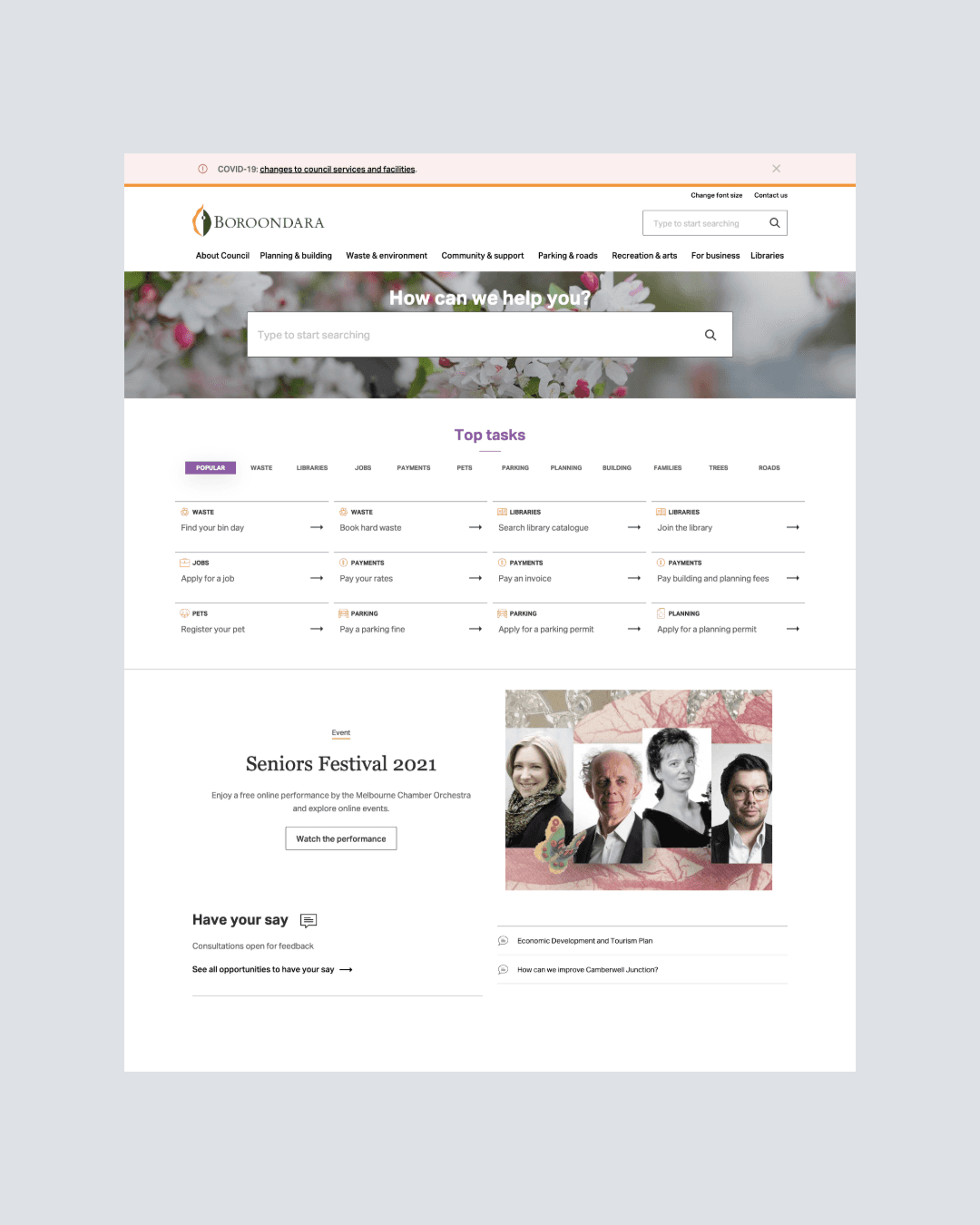
Before
What people were saying
How do I pay my fine?
What day are my bins collected?
I can’t find the task I want to complete
Heatmap studies showed sporadic scanning patterns and not what was expected. During IA usability testing (current state), I observed frustration around the sub-navigation area. There were friction inducing forms. The layout was causing problems and slower than expected to complete.
Problem Statement
How might we optimise the experience so customers can find what they need and complete tasks without assistance?
User Research
Finding the Evidence
In pursuit of an evidence-led approach our team embarked on a broad range of activities.
Heuristic evaluation
User research & testing
User interface audits
Information architecture uplift
Sitewide accessibility audit
Identify customer pain points in the user experience
User Research
What was uncovered
There was low engagement on mobile devices across the whole year. A small uptake of 2%. Heatmap studies showed sporadic scanning patterns and not what was expected.
In regards to information architecture (current state), I observed frustration around the popular tasks categories and how people struggled with navigation and search.
The forms were causing a lot of friction. Form layout was a definite issue and slower than expected to complete. In many cases they were abandoned which demonstrates lack of comprehension and perhaps too much complexity.
Actionable insights
Design Objectives
Local councils serve everyone from elderly residents filing a noise complaint to small business owners applying for permits. But most council websites were built for the organisation, not the people using them.
Using the actionable insights extracted from research I was able to achieve the following:
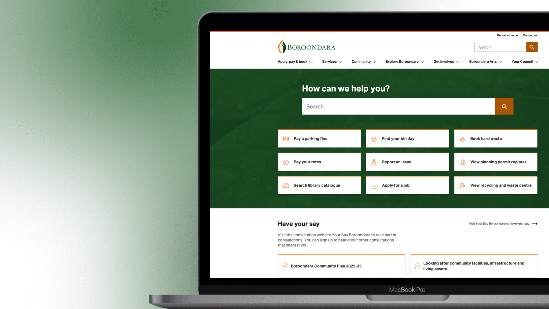
Build structure - Focus the attention on search and tasks. The page info was restructured so crucial content was displayed in prominent areas of the page.
Influence visitors and guide them to take action - Put the emphasis on the top tasks. Colour and texture to draw attention and prompt action.
Clear and concise content - Collaboration with Digital Content Team. Plain language and content layout designed. Media assets that showcase the benefits.
Visual consistency - Builds trust and familiarity. Refined the colour scheme, typography and assets. Ensuring accessibility for diverse audiences.
Why
Overall Benefits
Make channels accessible to all.
A mobile first approach
Intuitive interfaces will help customers of all ability levels to navigate more efficiently and widens the user pool.
Improve conversion rates. Customer is less likely to abandon their task and call our Customer Connect team thanks to:
A decluttered interface and improved aesthetic
Improved findability through improved information architecture.
Onmichannel ambitions are one step closer to being realised. Customers can engage with us on the channel of their choice at a time convenient to them.


2 months after release
The result
The results were outstanding. It was successful due to the quality of the insights coupled with usability heuristics and intended design choices. Removing the categories navigation was an impactful decision. Another significant change was the experience of the search bar in mobile. It expands and collapses which allows it to be hidden when not in use. The data gave me the confidence in my rationale and eliminating categories reduced the physical and mental effort for the user. Less tasks, less buttons, less complicated and much easier to complete an action.
Originally, there were 40 top tasks, which was reduced to 9 and ordered by popularity. The categories navigation removed completely due to confusion.
158% increase in unique clicks across the 9 top tasks.
Mobile usage on top tasks increased from 2% to 41%. Eliminating categories reduced the interaction cost. Less tasks, less buttons, less complicated.
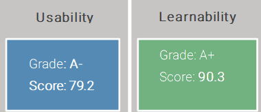
Overall usability of the website scored high at 81.4 (A)
Achieved “Strong” accessibility standards, WCAG Level 2.1 AA.
Learnings
What this taught me
Designing for a council means designing for everyone. There is no assumed tech literacy, some people are tech-savvy, others have never even touched a computer. Designing for diverse audiences strengthened my empathy. It meant having a deeper look at what it means to design inclusively. Such as for people with visual, auditory, cognitive, and motor impairments. Conducting user research and engaging directly with people who live with these issues provided valuable insights that helped to shape a more inclusive product.